
Warm, Cool, Neutral, or Bold: Helping Customers Understand Flooring Color
Jun 26, 2026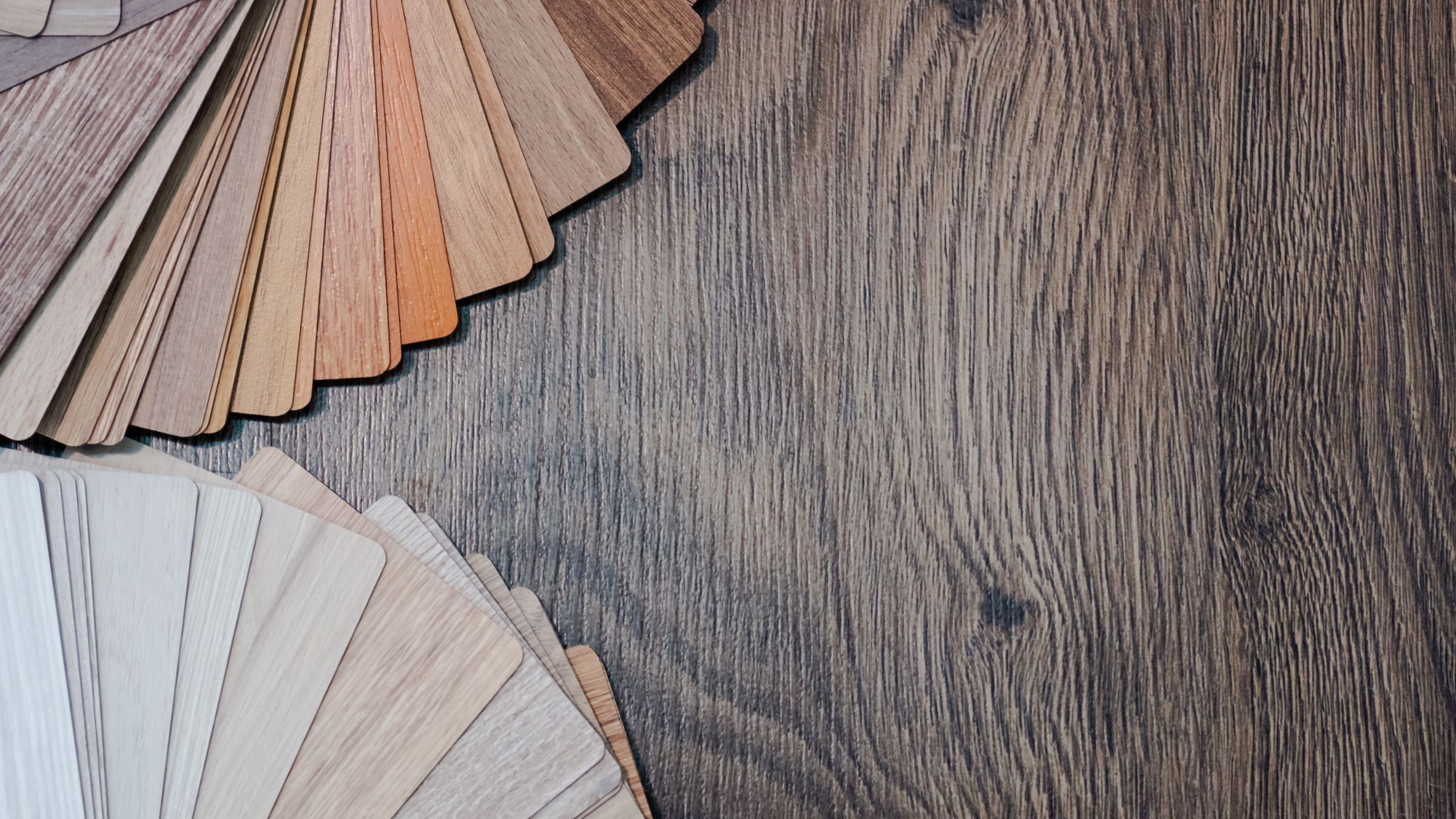
Color is often one of the first things customers notice when shopping for flooring, but it's also one of the hardest things for them to describe. Many arrive knowing what they like when they see it, yet struggle to explain why certain rooms, styles, or flooring options appeal to them.
The RSA’s job is to help customers translate what they’re envisioning into a flooring decision. Moving beyond broad color descriptions helps uncover the preferences behind their choices and creates a clearer path to the best-fit options.
The Most Important Thing to Understand: Warm vs. Cool Tones
Color temperature plays a major role in the mood a space creates. So, one of the most effective ways to narrow flooring options is to determine whether a customer naturally gravitates toward warm or cool color palettes.
Warm colors include reds, oranges, browns, and yellows. Cool colors include blues, grays, and silvers. Some colors, like green and purple, can shift warmer or cooler depending on the shade and what surrounds them.
Customers drawn to warm palettes often like:
- Natural wood looks with golden or honey undertones
- Flooring with beige, taupe, gold, or reddish undertones
Customers drawn to cool palettes often like:
- Wood looks with gray, ash, or weathered undertones
- Flooring with blue, gray, or green undertones
One thing to keep in mind is the importance of balance. Too many warm colors can make a space feel heavy, while too many cool colors can feel cold or sterile. By understanding what other colors are already present in the space, RSAs can help identify flooring options that can complement the current mood without pushing it too far in either direction.
Color Descriptors Aren't Always Specific
Customers often use words like bold, neutral, warm, or cool to describe the flooring color they want. It’s important to note that searches for “bold” decor have increased in recent years as people move away from design trends like “Millennial gray.”
The challenge is that those terms can mean different things to different people. One customer's idea of a bold floor may be a pop of color, while another may mean strong grain variation or high contrast.
That's why discovery questions, inspiration photos, and side-by-side comparisons are so valuable. They help clarify what the customer is actually responding to and make it easier to identify flooring colors that fit their vision.
Not Every Neutral Looks the Same: Why Undertones Matter
Neutral is another one of those ubiquitous but relatively vague words, because not all neutrals are the same. The difference often comes down to undertones, or the subtle colors beneath the main color. For example:
- A gray floor may lean blue while another appears warmer with hints of red.
- A brown floor may contain golden undertones while another feels cooler with hints of green.
- A beige floor may have soft yellow undertones while another has hints of gray.
These differences become even more important once flooring is installed. Undertones influence how a floor interacts with cabinetry, countertops, paint colors, furniture, and natural light. Here, RSAs can act more as a design consultant and compare products side by side for the customer so the undertones become clear.
Help Your Customers Make Confident Color Decisions
Customers don't need an education in color theory to understand flooring color. They need someone who can help them understand what they're seeing and why they like it.This is where a knowledgeable RSA can take a customer from confusion to a confident decision.
Explore our training programs to help your team build stronger design conversations and guide customers toward better flooring choices.
Stay connected with news and updates!
Join our mailing list to receive the latest news and updates from our team.
